A Fresh Start: Overview
MCommunity is a directory and group management tool created by the University of Michigan's IT department (ITS). Members of the school use it to look up people, create mailing groups, and manage access to web resources. As MCommunity was getting old and hard to use, ITS began work on a new version of the platform.
In 2017, ITS released a beta version of MCommunity. I was a member of a UX research team that worked on an in-depth evaluation of the beta to advise ITS on new features and usability improvements.
A Long Needed Reboot
MCommunity, U-M’s contact directory and group management app, was getting old -- the UI looked dated and hard to navigate. Members of the university started using other apps to manage their groups. In 2017, ITS released a new beta version of its platform with a UI/UX overhaul. They asked our team of five UX researchers to evaluate the usability of the beta to recommend new features and changes:
Our primary research goals were to:
- Identify pain points in the workflow and resolve them.
- Suggest changes to the user interface to improve navigation.
- Help ITS understand how their users use MCommunity.
Review the Current Beta
As a research team, our first task was mapping the workflow of the website’s main features. We did this to familiarize ourselves with the site and note potential UX problems.
The features we mapped were:
- Search for a community member
- Search for a group in the university
- Do an advanced search for a member or group
- Update your contact information on MCommunity
- Edit your own MCommunity group

Getting to know MCommunity's Users
How do university members use MCommunity and have been their experience with it?
We interviewed five members of the school to learn about how they used MCommunity in their school and work activities. In each interview, we asked the interviewee to share a story about using MCommunity and talk about their experiences with the platform. Our interviewees included: one professor, one IT staff member, one student org leader, and two students.
From our interviews, we learned several important points about our users use MCommunity:
- Mailing list convenience MCommunity's group mailing lists were the most used feature by our interviewees. The platform's mailing lists were convenient because they got caught by spam filters.
- Out of date information Users can't rely on the contact information in profiles because it is often out of date.
- Get me off this mailing list Users found it hard to figure out to leave an MCommunity mailing list that they were added to by someone.
- There's a beta? IT wanted to use user analytics in the beta to inform development, but none of the users we interviewed even knew about the beta.
Based on what we found, we recommended ITS make the following changes:
- Define the platform's selling point Some interviewees were not sure what MCommunity is for exactly. We recommended ITS emphasize the convenience of using the platform's mailing lists to attach their target users.
- Remind users to update their profile Prompt users to update their MCommunity profile once a year. A reminder will encourage more users to keep contact information up to date.
- Ask for permission First MCommunity users did not like receiving emails from mailing lists they did not choose to join. To reduce spam, ask the user before putting them in someone else’s mailing list.
- Advertise the Beta IT should add a button to the homepage encouraging members to try the beta so they can get more user data for their analytics.
Personas
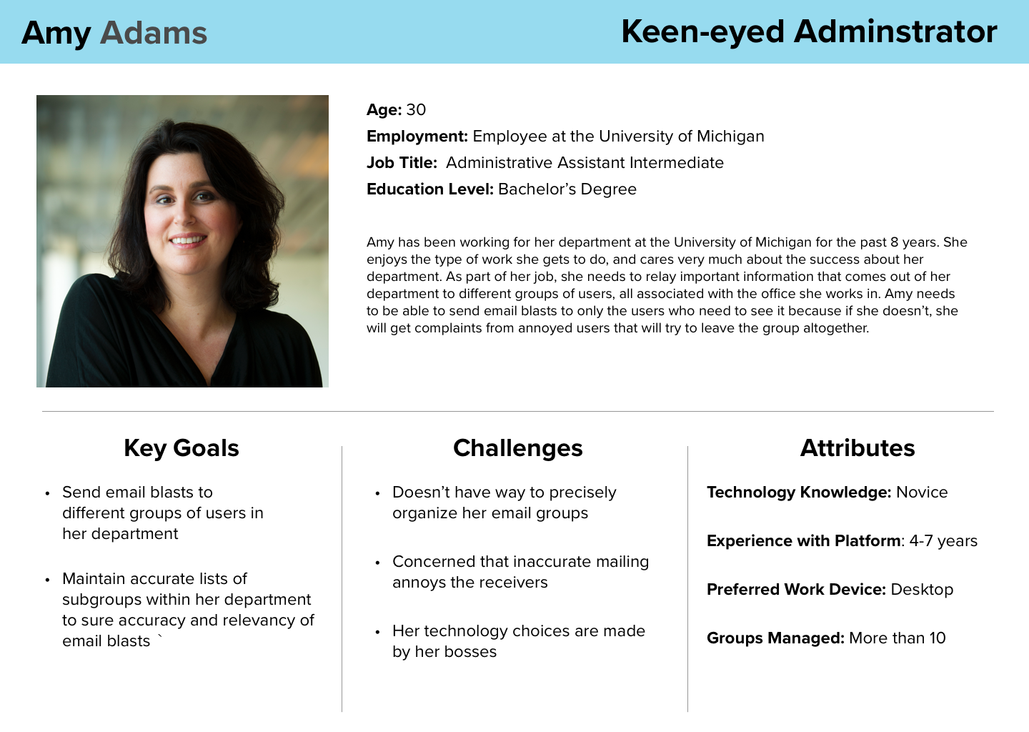
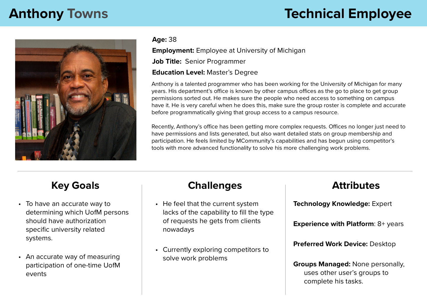
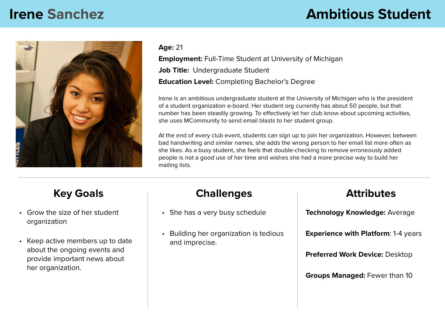
To further help ITS understand our findings and recommendations, I created 3 personas representing the 3 main types of MCommunity users.
Checking out the Competition
What can we learn from competing products to improve MCommunity?
We compared MCommunity to its competitors to analyze the strengths and weaknesses of its main features. The features we looked for each product were:
- User Search: Does the product allow users to look for other users? If so, how?
- Auto-fill/Suggestions: Does the app assist users in filling out their mailing lists?
- Identity Management: To what extent can a user edit their personal information?
- Sending Email Campaigns: Can you use the product for marketing and mass emails?
- Access Management: Are there user permissions that grant and remove access to parts of the product?
We looked at five types of competitors for our analysis:
| Direct Competitors | Partial Competitors | Indirect Competitors | Parallel Competitors | Analogous Competitors |
|---|---|---|---|---|
| Products which do the same things for the same purpose | Products that share some functions but not all. | Products that do the same things but in a different way. | Products with a similar purpose provided in a different medium. | Products that have a different purpose, but could inspire improvements to functions. |

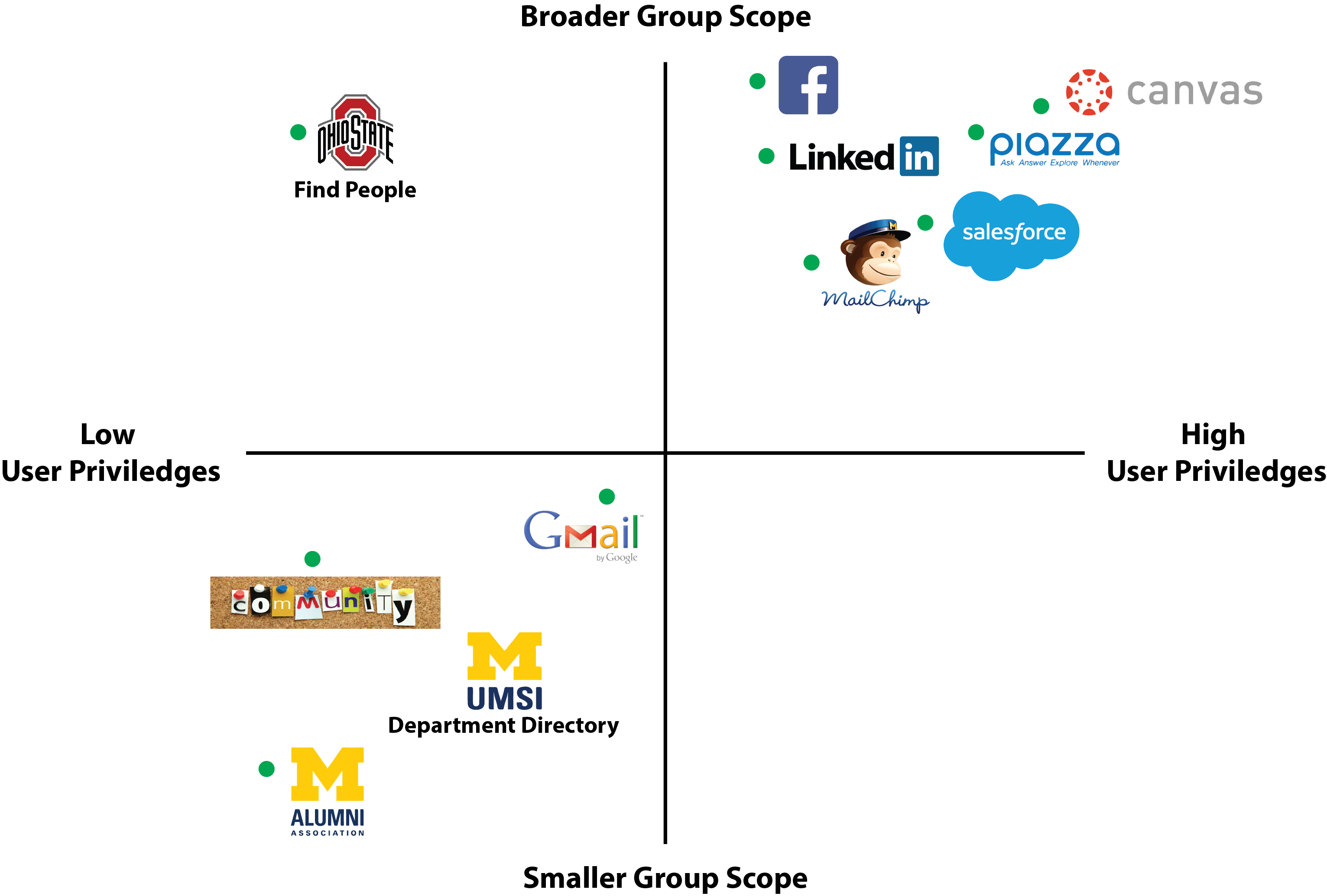
After looking at all of the products, we made two key findings:
- Personal information checks Although MCommunity includes a person lookup tool, it does not verify users' contact information. In contrast, some MCommunity competitors will periodically remind their users to keep their personal information up to date.
- Tricky Searches Unlike many of its competitors, MCommunity's search feature does not include autofill or autocomplete. As a result, users need to enter search terms accurately to get good results.
Based on what we saw in competing products, we made the following recommendations:
- Add autocomplete to search We suggested that ITS add autocomplete to the search feature to shorten search time and rely less than perfect spelling.
- Periodic Verification At the start of each school semester, MCommunity should ask users to review their profiles to encourage users to update their information. The platform is more reliable as a directory when users' contact information is up to date.
Getting the Numbers
What parts of MCommunity do members find difficult?
Our team wanted to find out what tasks MCommunity users found important, hard, or both. To get the information we needed, we released an online survey through the School of Information’s department mailing list (A MCommunity mailing list!).
A total of 87 people responded to our survey. We learned that:

Leaving a mailing group was ranked the hardest task to complete.

Being unable to find a person, or getting wrong information after finding someone was ranked the most frustrating part of the platform.

72% of respondents have never used MCommunity on a phone or tablet.
A Deep Dive into MCommunity Beta’s Usability
What major usability defects does MCommunity have and how could we correct them?
We conducted a heuristic evaluation to look for usability defects in the MCommunity beta. We looked at the entire platform, but focused on the group management since users valued it most.
Our evaluation process went as follows:
- We created a checklist of criteria based on Neilsen's 10 Usability Heuristics.
- Each team member used the checklist to do a separate evaluation. For each criterion, the reviewer rated the usability problem from 1(no issues) to 4(must fix).
- Our team met to review our ratings and analyze what we found.
- Give one group rating for each criterion.
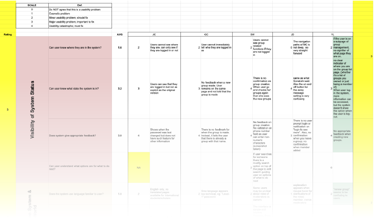
From our evaluation, we discovered three key issues:
- Documentation is hard to find: Everyone evaluating the platform found it hard to find help on the site when they got stuck on a task.
- No Error Prevention: MCommunity does not warn the user if they leave a page with unsaved changes.
- User roles in groups are unclear: There are three user roles for mailing group members -- Admin, Moderator, Member. Each has a different set of permissions. This difference is not made clear by the platform.
To fix these problems we recommended:
- Make getting help easier: Insert a documentation link into the navbar for easier access.
- Error Prevention: When the user leaves a page without saving, warn them with a pop up first.
- Clarify the Group Roles: Add information explaining the group roles to the main group management page, My Groups, as a reminder for users.
Putting the Beta to the Test
Where are the pain points in MCommunity’s group management features?
Our team finished our study with a usability test focusing on its group management features. We conducted this test to identify UX problems in the user workflow, especially with group management tasks. Each team member ran a test following the same script which asked users to complete five tasks:
- Creating a group
- Adding users to the group
- Editing the group privacy settings
- Aliasing the email address to send emails using the group name
- Deleting the group

Out Test Findings
-
Pushed out of sight
Aftering new group members, most test-takers forgot to save their changes before leaving the edit page. This mistake was common because adding a new member pushed the save button off-screen. As a result, many test-takers left the page and lost their work without knowing that there was a save button. -
Email Aliasing is very hard
MCommunity group admins can add a group name as an alias for their school email account, but it is hard to do. Only one person did it successfully. This task frustrated our test-takers, as not only was the task difficult, most could not find the documentation page to get help. -
Group name covered during deletion
Before users can delete a group, they must enter the group name into a pop-up to confirm their action. While good practice, the pop-up is poorly positioned. It covered the group name, causing our test-takers to close and reopen the pop-up several times to check their spelling.
Our Recommendations
- We reiterated our recommendation to add a warning when the user leaves a page with unsaved changes. Losing work due to a missed step was a problem in both our heuristic evaluation and our usability test.
- Add a documentation link to MCommunity’s navigation bar to increase the visibility of help. This addition makes it clear to the user how they can get guidance for hard tasks such as email aliasing.
- To avoid the back and forth clicks when deleting a group, ITS should include the group name in the pop-up. That way, students can check their spelling with less repetition and lower the chances of a typo.
Outcomes
While MCommunity remains in beta, ITS’s development team has taken our changes to heart implemented several of our suggestions:
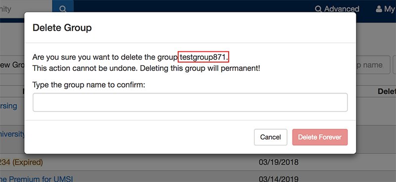
When you delete a group in MCommunity now, the group name appears in the delete modal.
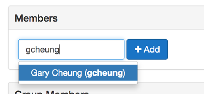
When adding a new member to MCommunity, autocomplete suggestions will appear after typing part of a name or username.
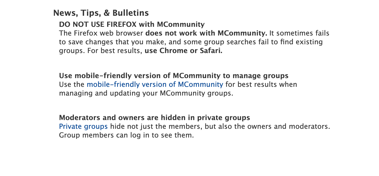
The old version of MCommunity now has a button encouraging members to try the new version of the platform.
What I Learned
-
Keep Communicating with the Client
Throughout the research process, we shared our research findings with our client. Getting feedback from their team helped us understand their product goals, allowing us to focus our research on the most impactful areas. -
Research does not always go perfectly
Sometimes, research does not go as planned. When it happens, be ready to adapt. When my usability test participant couldn’t attend in-person, I tweaked the testing procedure to run the test remotely. Although not ideal, this allowed me to save the situation and still get insights.

